If you are a front-end developer, you probably have used, or at least heard of Bootstrap. Bootstrap was originally created at Twitter as a framework to encourage consistency across internal tools. Today, it is a free and open-source CSS framework directed at responsive, mobile-first front-end web development.
It will take days and weeks to talk about all of Bootstrap’s features. In this post, I will focus on one of the most important features of Bootstrap, the Grid System.
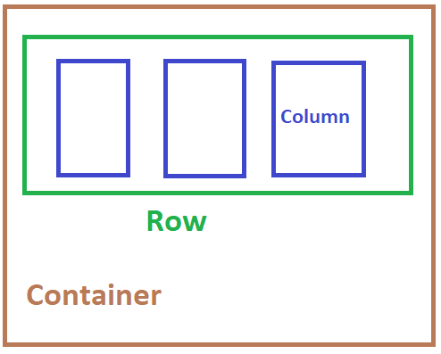
The three pillars (pun-intended) of Bootstrap Grid System are:
- containers
- rows
- columns
The three rules of the Bootstrap Grid System are:
- Rows should be placed inside a Container.
- Rows are only used to contain Columns, nothing else.
- Columns must be the immediate child of a Row.

The rows & columns always work together, and one should never have one without the other.
Container
The Bootstrap .container class is the root of the grid system, and it is used to control the layout of the page.
The .container element should be the root element, containing the child .row elements.
So your basic layout should have the following strucutre:
<body>
   <div class="container">
    ...
   </div>
</body>
Aside: you can have multiple
.containerelements on a single page, but it is not recommended that you nest them.
Beside the .container class, which is the recommended class to use for responsive desgin, you can also use .container-fluid class to achieve width: 100% across all viewport and device sizes.
The following:
<div class="container">
  Hello! I am in a simple container.
</div>

<div class="container-fluid">
  Hello! I am in a full-width container.
</div>
will produce the output:

As you can see, there is a difference in the paddings between container and container-fluid.
Row
Bootstrap rows positions your elements horizontally across the screen. Following Rule 2, they are used to wrap your column elements.
You can as much rows you would like on your page, but they have to be in a container, like below:
<div class="container">
  <div class="row">
    ...
  </div>
</div>
The row class will give a padding on both left and right side of the element, This is called “gutters” in Bootstrap. If you do not want
these paddings, they can removed with the .no-gutters class. This removes the negative margins from .row and the horizontal padding from all immediate children columns.
The following image shows the no gutters effect:

Aside: Need an edge-to-edge design? Drop the parent .container or .container-fluid.
Main take away here is that rows are only used for containing columns. If you place other elements inside the row along with columns you will not get the expected result.
Rows have to be placed in containers. If you don’t do this, you will get a horizontal scroll on your page. This happens because rows have negative left and right margins of 15. The container has 15px paddings so it counteracts the margins.
Columns have to be children of the row. Otherwise they will not align. The rows and columns are created to work together in this strict hierarchy.
Column
Bootstrap is desgined with responsiveness in mind. The columns are designed so that it will work nicely in both small and large screens.
A simple 3 column design will look like the following:
<div class="row">
  <div class="col">col</div>
  <div class="col">col</div>
  <div class="col">col</div>
</div>
The col class will mark the elements as a Column, and automatically set the width of these elements to fit the current
resoultion. You can also manually set the sizes of the column by giving it a integer size. The total size sum should add up to 12.
If you want the first column of a 3 column design to be smaller than the other 2, it can looks like the following:
<div class="row">
  <div class="col-2"> smaller </div>
  <div class="col-5"> bigger column </div>
  <div class="col-5"> bigger column </div>
</div>
The sizing are great and all, but what if you want to design something that will looks nice for both small and large screens?
For example, I want the the last two columns to stack up instead of side-by-side only when I am on a smaller screen.
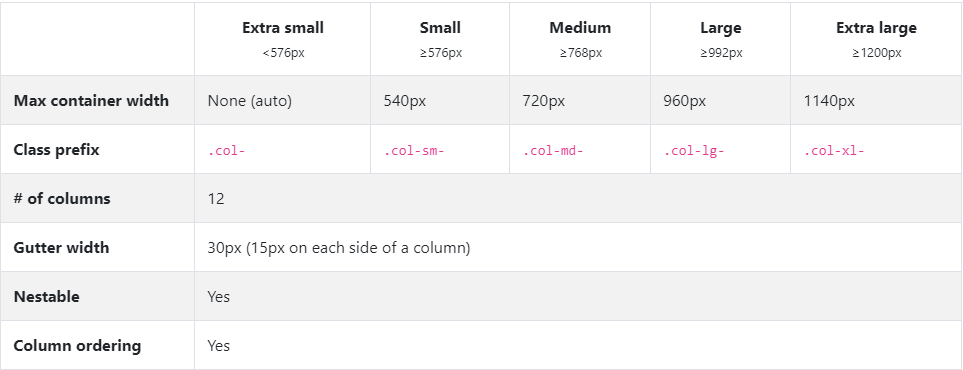
This is where we will be using the Column Breakpoints System. The following chart is a summary of the breakpoints:

A breakpoint is a Bootstrap variable that stands for a screen resolution. When you are specifying a breakpoint for a class, you are telling the class to be active only for resolutions that are at least as big as the number that the breakpoint holds.
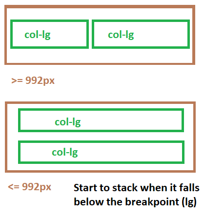
If you were designing a page made for large screens. You would probably use the col-lg-* class. By using the lg class,
The columns will only start to stack when the screen resolution is less or equal than 992px.
Like the following behavior:

This behavior is what makes the breakpoints so powerful. Depending on the resoultion you are designing for, you can set different breakpoints for your columns.
There are a lot more to the breakpoints and columns on the official Bootstrap Documentation. Make sure you head over there and check out rest of the features!